Netflix Updates Its iPhone App with a More Streamlined Design
It's not just high-quality content that is going to set a streaming service apart from its peers. Continuing to refine the user experience remains part of the battle to minimize churn.

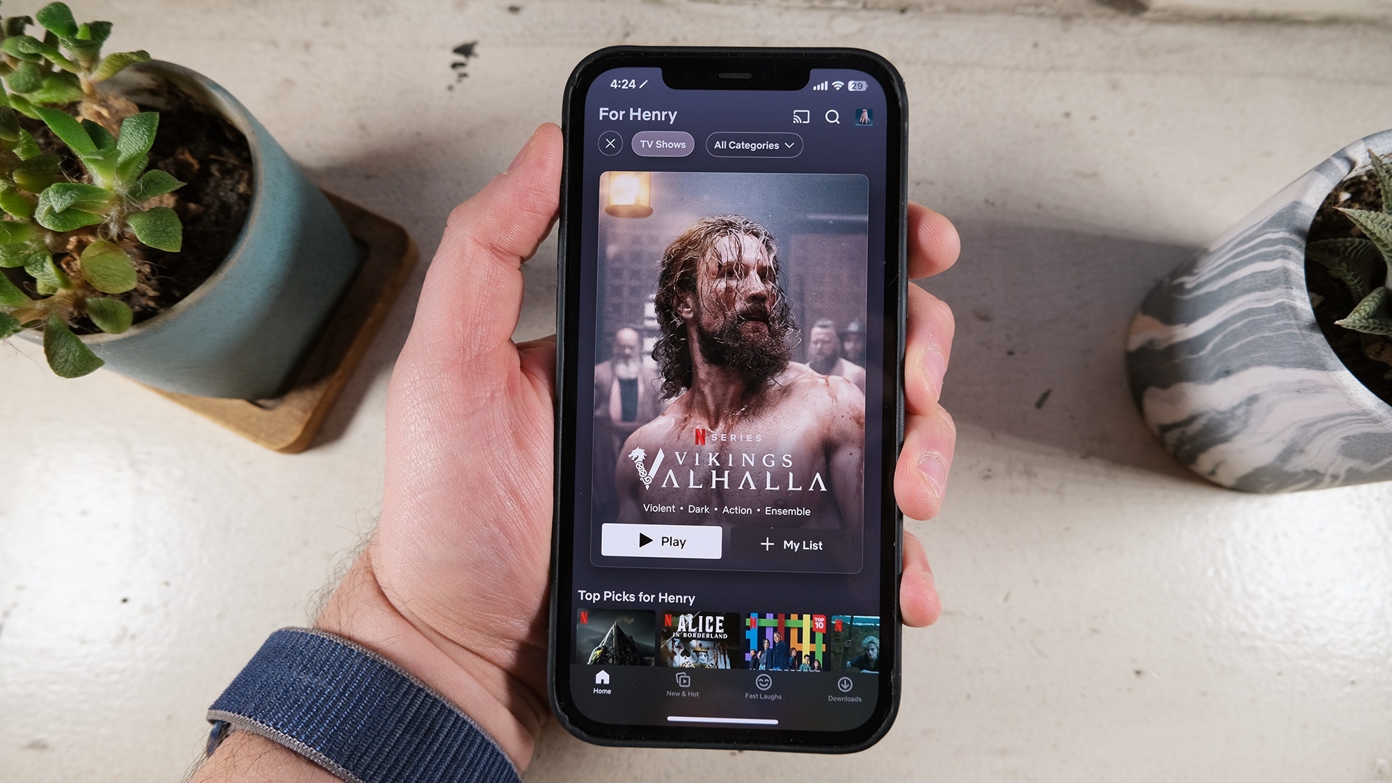
It's not just high-quality content that is going to set a streaming service apart from its peers. Continuing to refine the user experience remains part of the battle to minimize churn. Yesterday, Netflix released updates to its iPhone app, bringing with it a new interface that includes new billboard layout, card transitions, animations for both the launch and profile screens, haptics, and much more.
"We recently updated the Netflix iOS app with better visuals, more responsive interactions and motion design. This latest global update includes features like a new style for promoting what to watch, thematic background on your favorite shows and movies, new profile animations and more," a Netflix spokesperson told TechCrunch.
Former Netflix product designer Janum Trivedi tweeted about the update alongside a video that shows the new version of the app. Trivedi wanted the app to “feel more fluid, delightful, and polished,” he wrote.
This last year, I’ve been leading a UI refresh to make Netflix feel more fluid, delightful, and polished.
Today, all that work shipped!
Huge thanks to @nebson and @b3ll for helping bring this to life ❤️
Details below but try it out yourself! pic.twitter.com/cZFb7c42Fd
When iPhone users open the Netflix app, they will see a large card of a movie or TV series taking up most of the screen. This billboard layout is to promote a suggested title that's available on the streaming service. What's of interest in the update is that the card now employs the parallax effect, which is what occurs when the wallpaper moves or even shifts about ever so slightly when the iPhone user looks at it by tilting their device back and forth. Also included with the title cards are a colored border, the main color in the movie or TV artwork.
It also appears that the "Info" tab at the bottom of the card has been removed. Instead, users can simply click on the card, bringing them to a separate page with information about the show or film.
The card transition in the app was less fluid previously. When a title was selected, then info section would just slide up. The new card transition shows the card growing bigger and then info opens into a full-screen version.
Another interesting update is the profile screen animation. There will no more like the old app side-sliding that appeared while switching profiles. Instead, users will see the profile icon expand large before jumping to the center, shrink to its normal size, and then bounce up to the top-right corner of the page.
Subscribers at Netflix will likely love the refresh of the iPhone app as navigation feels more fun and interactive.
