Google Calendar Receives a Design Refresh and Adds Dark Mode.
The Internet giant is updating the web version of Google Calendar, polished in line with the new Material Design 3 guidelines and adding dark mode support

The Internet giant is updating the web version of Google Calendar, polished in line with the new Material Design 3 guidelines and adding dark mode support
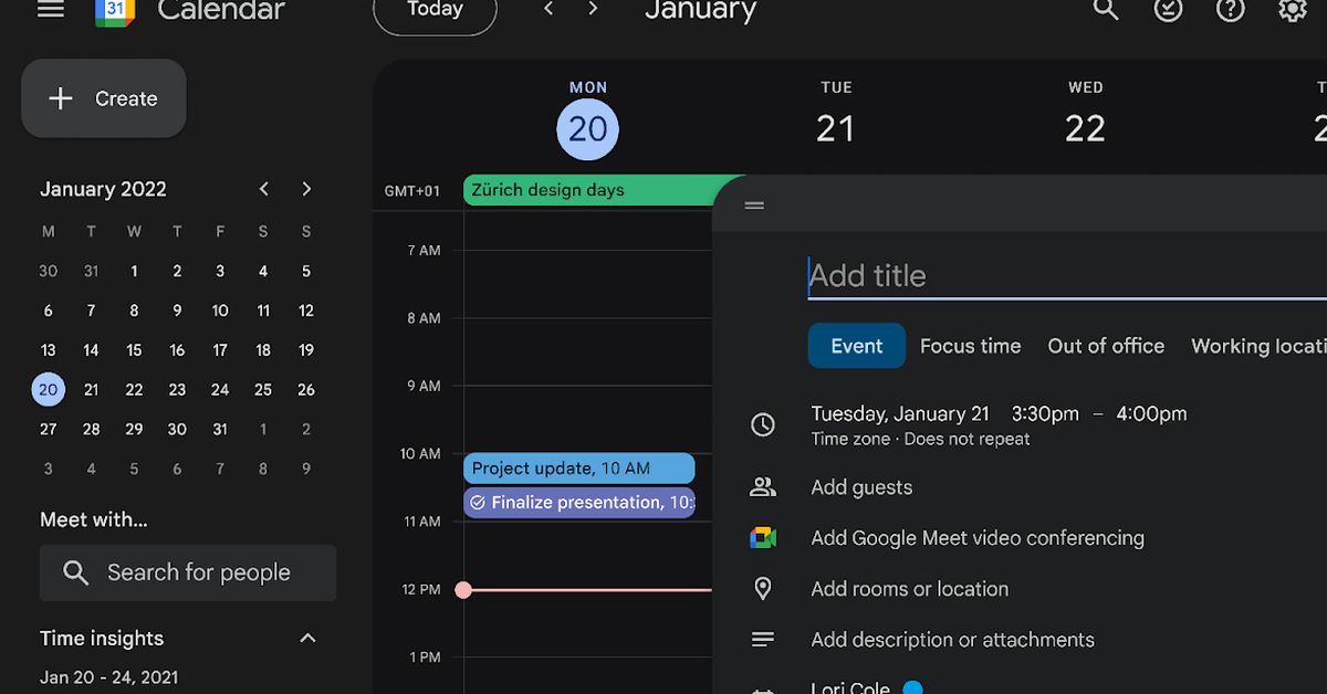
Controls, for instance buttons, dialogs, and sidebars are "more modern and accessible," according to the company. Screenshots on the Google Workspace blog indicate that Google now applies rounded edges to buttons and dialogs while also refreshing color schemes.
Google is also refreshing icons and typefaces throughout the Calendar UI to enhance readability and clarity.
The good thing about this update (for me at least) is it now supports Dark mode. There are actually three options: Light mode, Dark mode, or Device Default.
Google said all these design updates extend into the list view of tasks, too. The update should start rolling out in the next few weeks.
