Apple has entered the competition to develop an AI icon that resonates and makes sense for users.
It's been an exciting week for the AI community, with Apple joining Google, OpenAI, Anthropic, Meta, among others in the long-standing competition to find an icon that even remotely suggests AI to users.

It's been an exciting week for the AI community, with Apple joining Google, OpenAI, Anthropic, Meta, among others in the long-standing competition to find an icon that even remotely suggests AI to users. And like everybody else, Apple has punted.
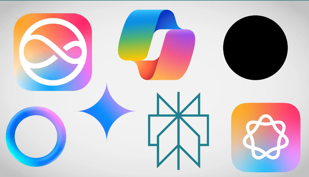
The Apple Intelligence is in the shape of a circle made from seven loops. Or is it the silhouette of a circle with an off-centered infinity symbol inside? No, that's New Siri, powered by Apple Intelligence. Or is New Siri when your phone glows around the edges? Yes.
The thing is, nobody actually knows what AI looks like or what it's supposed to look like. It does everything but looks like nothing. Yet it needs to be represented in user interfaces so people know they're interacting with a machine learning model and not just plain old searching, submitting, or whatever else.
While implementations differ in branding this supposedly all-knowing, all-seeing, all-doing intelligence, they have converged on the idea that the avatar for AI should be non-threatening, abstract but rather simple and in no way anthropomorphic. (They appear to have rejected my suggestion that these models always speak in rhyme.)
Early AI icons were sometimes little robots, wizard hats or magic wands: novelties. But the connotation of the former is one of inhumanity, rigidity, and limitation: robots don't know things, they aren't personal to you, they perform pre-defined, automated tasks. Magic wands and the like suggest irrational invention, the inexplicable, the mysterious— perhaps fine for an image generator or creative sounding board, but not for the kind of factual, reliable answers these companies want you to believe AI provides.
Corporate logo design is usually a strange admixture of strong vision, commercial necessity, and compromise-by-committee. And you can see these influences at work in the logos pictured here.
The strongest vision goes, for better or worse, to OpenAI's black dot. A cold, featureless hole that you throw your query into, it's a bit like a wishing well or Echo's cave.
Biggest committee energy goes, unsurprisingly, to Microsoft, whose Copilot logo is effectively indescribable.
But notice how four of the six (five of seven if you count Apple twice, and why shouldn't we) use pleasant candy colors: colors that mean nothing but are cheery and approachable, leaning toward the feminine (as such things are considered in design language) or even the childlike.
Soft gradients into pink, purple and turquoise; pastels, not hard colors; four are soft, never-ending shapes; Perplexity and Google have sharp edges, but the former suggests an endless book while the latter is a happy, symmetrical star with welcoming concavities. Some also animate in use, giving the impression of life and responsivity (and draw the eye, so you can't ignore it — looking at you, Meta).
Overall, the impression wanted is one of friendliness, openness, and undefined potential - rather than something like, for example, expertise, efficacy, decisiveness, or creativity.
Overanalyze? Over or under 20 pages of design treatment documents for each of these logos? I'm guessing over. Companies obsess over the details. (Yet somehow manage to miss the hate symbol dead center, or create an inexplicably sexual vibe.)
The point, though, isn't that corporate design teams do what they do, but rather that no one managed to hit on a visual concept that unambiguously says "AI" to the user. At best, these colorful shapes communicate a negative concept: that this interface isn't email, nor is it a search engine, nor a note app.
Email logos tend to be in the form of an envelope since, quite obviously, they are electronic mail, both theoretically and practically. A universal "send" icon for messages is a pointed version sometimes split, akin to a paper airplane, which is suggestive of a piece of paper in flight. A gear or wrench is typical of settings iconography, suggesting adjustment of an engine or a machine. Such ideas are universal enough to cut across languages and to some degree, generations.
Not every icon can allude so clearly to its corresponding function. How does one indicate "download," for example, when the word varies across cultures? In France, one telécharges, which makes sense but isn't really "download." Yet we have arrived at a downward-pointing arrow, sometimes touching down on a surface. Load down. Same with cloud computing we adopted the cloud, though, in fact, it is a big marketing phrase for "a huge datacenter somewhere". But what was the alternative, small button of a tiny datacenter?
It is still little known to consumers who are being asked to use it in place of "other things," a highly general category that purveyors of AI products are loath to define, since to do so would imply that there are some things AI can do and some it can't. They are not willing to yield to this: The whole fantasy is dependent on AI being able to do anything in theory, it being but a matter of engineering and compute to do so.
In other words, to say what Steinbeck said: Every AI thinks of itself as a temporarily embarrassed AGI. (Or I should say, is considered by its marketing department, since AI itself, as pattern generator, considers nothing.)
Meanwhile, these companies must continue to call it by a name and give it a "face" — though it is telling, and refreshing, that no one actually chose a face. And yet even here they depend on consumers, who never wring their hands over GPT version numbers as a curiosity but instead talk about ChatGPT; who can't draw an analogy with "Bard" but give their assent to the focus-grouped "Gemini"; who never wanted to Bing it (and especially did not want to talk to that thing) but don't mind having a Copilot.
Apple, on the other hand, has gone out and shotgunned it: Ask Siri to query Apple Intelligence (two different logos), which happens in your Private Cloud Compute (not at all related to iCloud), or perhaps even forward your request to ChatGPT (no logo allowed), and your best clue that an AI is listening to what you're saying is … swirling colors, somewhere or everywhere on the screen.
Till the AI itself becomes a bit better defined, icons and logos designed to represent it will probably remain vague, unmenacing, abstract shapes. A colorful, ever-changing blob wouldn't steal your job, would it?
